Promotional Poster
Brief
One of my weekly tasks during first semester was to create a promotional poster for an art exhibition in which colour is explored.
Why Van Gogh's Immersive Experience?
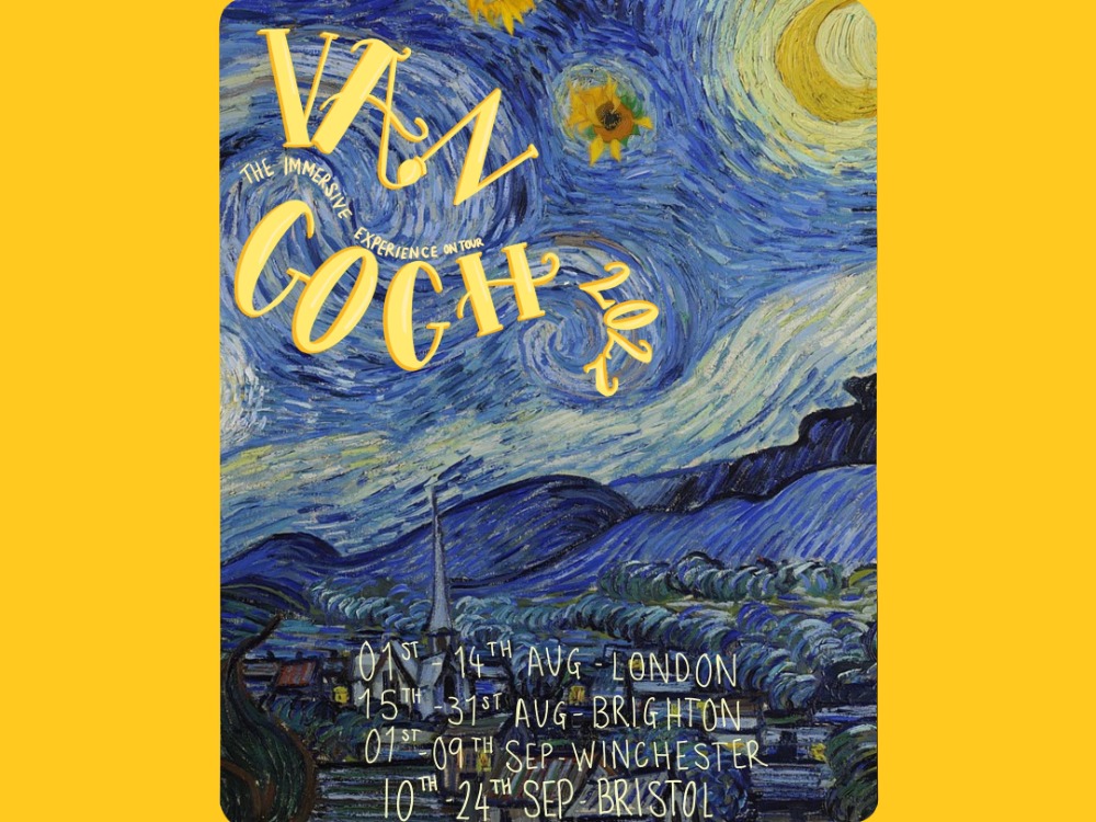
For my poster, I knew I wanted to create a promotional asset for the Van Gogh Immersive Experience. This is a 360 degree digital art exhibit that invites you to step into the universe of the Dutch genius, Vincent van Gogh. It has won serval awards and tours around the world at different major cities. I have wanted to go since I found out about it in 2021 which was why I wanted to create a piece for it.
Idea Generation

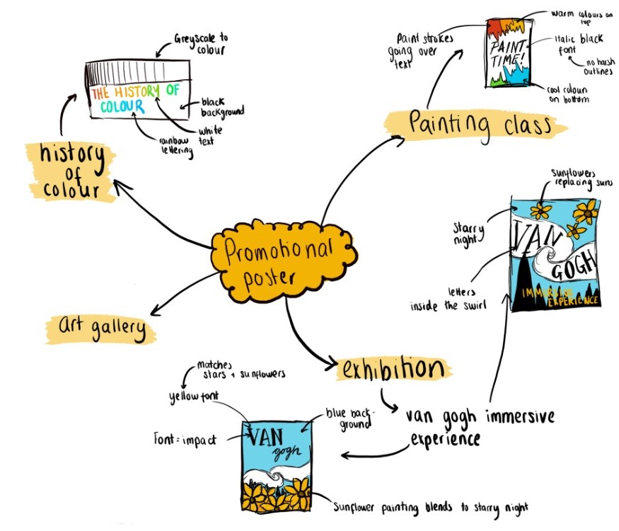
When choosing the design of the poster, I decided that I wanted to feature Van Gogh's starry night in the poster design. I decided that I wanted to include font that curved around and fitted into the white swirl that goes across the painting. From there, I also decided that I wanted to include his sunflower painting to replace the stars. This was tricky as the brightness and saturation of the two paintings differed significantly. This meant that I had to add saturation to the sunflower painting and blend the edges to ensure that it fitted well with the scheme.
Typography
In terms of the colours used, I initially decided on a bright yellow font that would match the colours of both the sunflowers and the moon, however I then decided that a lighter colour would work better and would be easier to read. This meant that I added the bright yellow as a drop shadow rather than the actual colour of the text. This worked much better, and I then used this light yellow for the rest of the text that you can see on the image.
In terms of fonts that I used; I knew that I wanted to create a serif font which matches the elegancy of the art work. I didn't want to have the text typed as I wanted it to be imperfect to show more of Van Gogh's personality, who was someone who struggled greatly with his mental health, so perfectionism was a massive struggle of his.
However if I was to redo this piece I would add the tour dates and locations shown at the bottom of the poster, in a typed font to make it look more professional.
See all year 1 work