ISTD
Brief
Capture a specific political landscape at this point in history, making it accessible to those voting for the first time.
Spend time researching the political landscape of either your home nation, a specific country of interest, or an internationally relevant organisation. Whilst you may have a personal view on the current state of affairs, develop a focused and neutrally positioned typographic tour-de-force that makes accessible the place of politics for a 21st century voting audience.
This task is a 3-week condensed version of the International School of Typographic Design annual competition, but you have the option of continuing it on for the full project.
Background Information
'In a world where our opinions are often shaped by mass media, fake news blurs what is/isn't 'real' and the success of an election has as much to do with algorithms on Twitter or Facebook, we have (arguably) lost our sense of what political parties, politicians and the policies that underpin our daily lives actually represent. Beyond this, globalisation has made local politics an international concern, shaping economic growth, global conflict, and necessitating the moderation of global affairs by 'non-' or 'inter-' governmental organisations (such as the UN, WHO or Amnesty International).
Each country has a political history, a unique framework within which it is currently governed, and individuals or organisations who champion certain principles and beliefs. Democracy, dictatorship, devolution? Far left, far right, extremist? Advocate, apathy, truth? Human rights, intimidation, freedom of speech? People, power, the body politic? There is a visual tumult of facts and data, opinion and rhetoric that cloud our ability to see politics clearly.
Your job is to change this.'
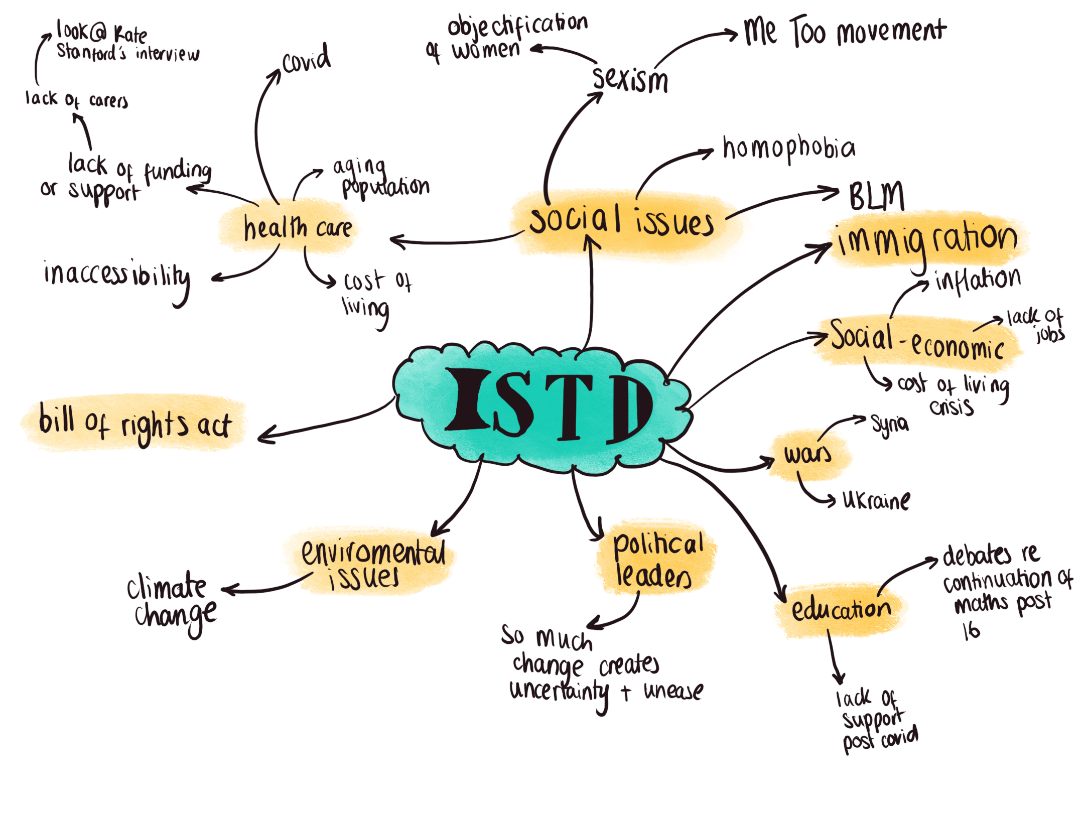
Brainstorming
Research
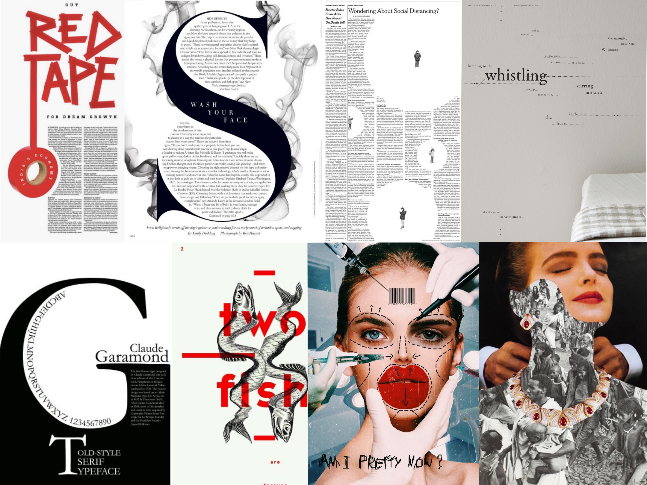
Based off my initial brainstorming, I decided that I wanted to centre the project around either disability rights or feminism. From here I started to research different examples of previous years submissions, different ways of printing, exploration of different type styles and looking at different artists.
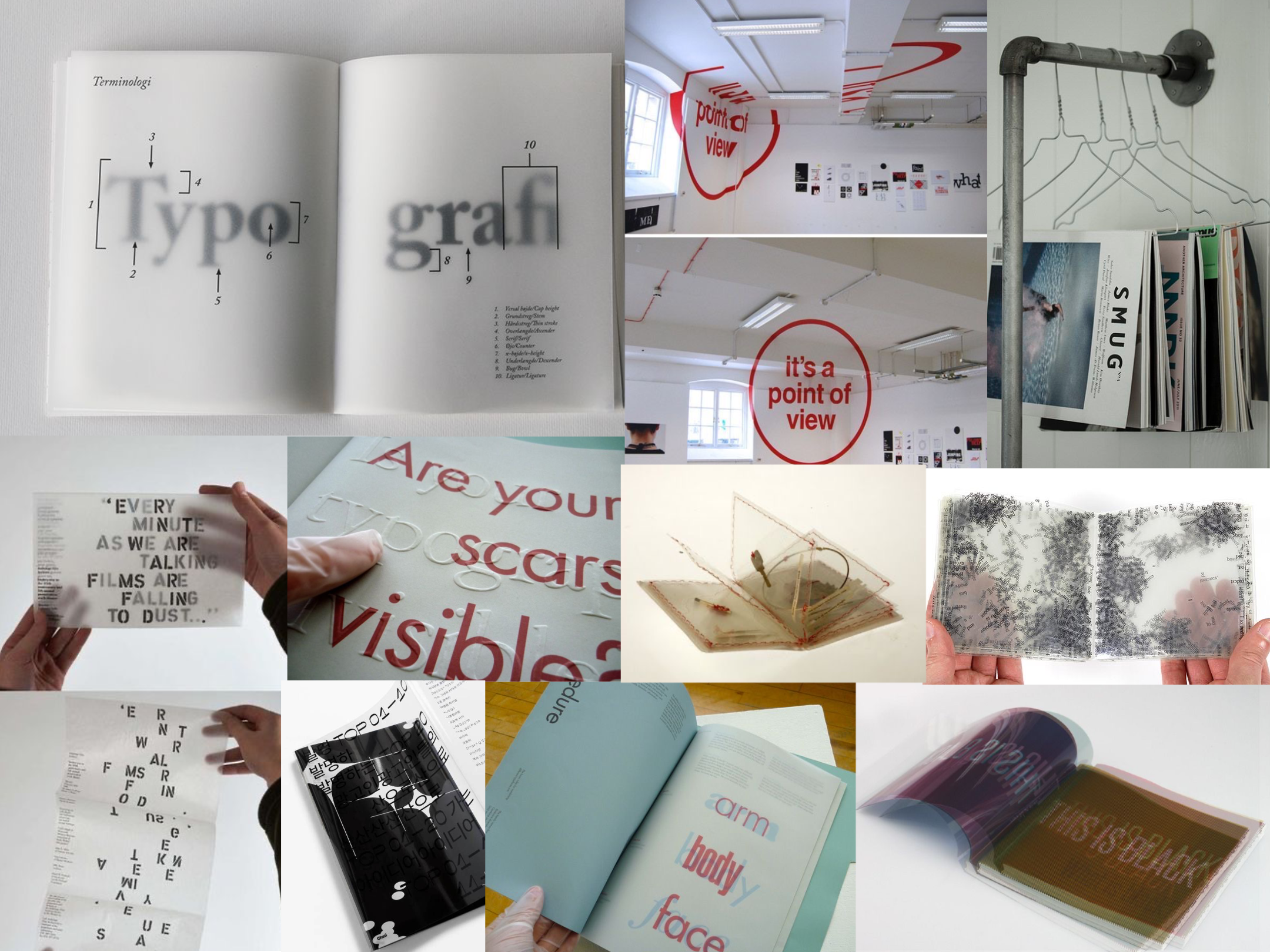
Forms of Printing
Artist Research: Betty Tompkins
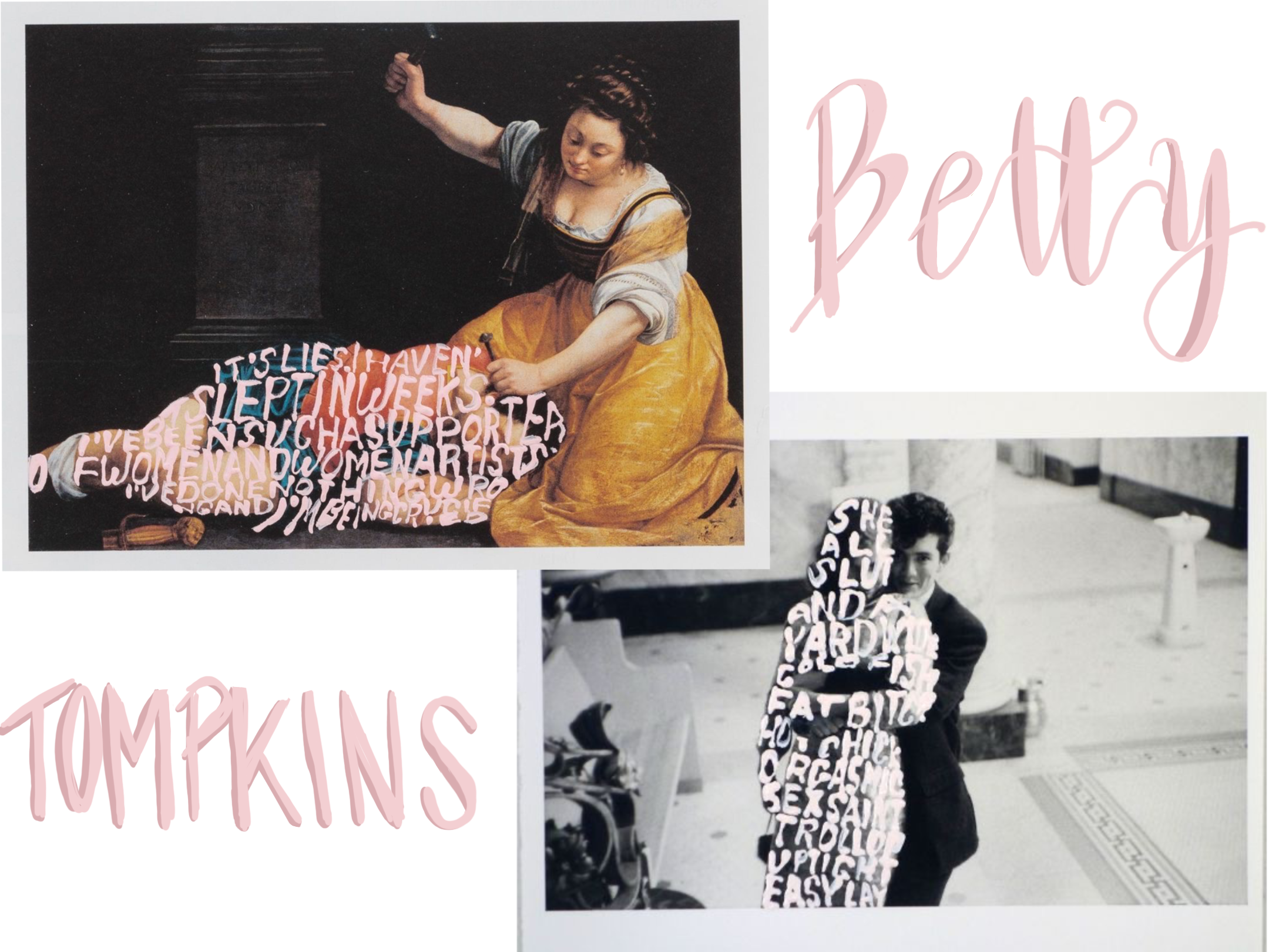
One of the artists who I researched is Betty Tompkins, a feminist artist who is changing the world of art. Her career started off slow but by 2002, she had her break in the industry. Her 'f*ck paintings' featured extreme close ups of photorealistic genitals. 'Her paintings of masturbation and penetration inverted the male gaze and addressed taboo themes of female desire— she was driven not by an agenda, but by passion and curiosity, unhindered by the expectations of her sex'.
However the collection of her's that truly caught my eye was her 'woman words' project which begun in 2002 and repeating in 2013. She invited members of the public to send her verbal descriptors of women. She received 1,500 unique words and phrases in 7 languages in the first appeal alone. 'The four most often repeated words were the same in both groups: 'b*tch', 'c*nt', 's*ut', and 'mother','. 3 of these terms are derogatory and the other reduces females down to just a parent. There is no positive perception of women that is presented by these words.
Only dehumanising words.
Imagine if we used these words as the top descriptive words for men. Imagine the public uproar that would come with that, but when its being used to address women its seen as a social norm. That's not right.
Tomkins used these descriptors that were sent in and paired them with different famous paintings, with the words written in a baby pink coloured font that covered the women in each of the pictures.
When I first saw her work, I was astonished at how candidly she paired these horrific insults with such beautiful works of art that were historical masterpieces. I love the rawness that comes with her work. She draws you in instantly because of the recognition of the famous pieces but you can instantly tell that there is text on top of them, however its only once you start to get closer and study them, do you actually realise what the text says. It's like unravelling the layers of an onion. I think this is a reflection of women's self-worth and self-esteem as well. So many women have internalised these insults and have started to believe that they are true, which is shown with the pieces as they are showing the insults inside the women.
I think that what Tompkins is doing by breaking down the gender norms and addressing these massive issues, is truly changing the world of art as well as having an impact on society as a whole. Unless we have a drastic statement piece, like her work, then we will never get the conversation moving and these issues will just be left unaddressed.
Artist Research: National Disability Arts Collection and Archive
The NDACA is the heritage story of the Disability Arts Movement. Every piece that they feature in their collection was made by a disabled person of a disability activist. Each piece that they feature is painfully relatable for me as a disabled person. Each piece is created to spark a reaction within you, whether that be anger or anguish or humour at the jokes which have been created, for people to laugh with the disability community for once, rather than laughing at us. This collection of pieces includes over 3,500 images of artworks, photographs, films, articles and exhibitions that tell the story of disability arts and the battle for disability rights in the UK.
Artist Research: Poppy Nash
One of the artists that's featured in the NDACA is Poppy Nash, a communications design student, who has type one diabetes. Her work explores how overwhelming her day-to-day life is when trying to calculate everything before eating anything. She has also created pieces that look at disability with a widder lens as well. This work includes face mask designs which helps educate the public on the impact of the pandemic on chronically ill people. Dresses that feature slogans from t-shirts worn by disability protestors in the 80's and 90's. A series of workshops and created disability arts banners for the Tate and is now displayed in the NDACA.
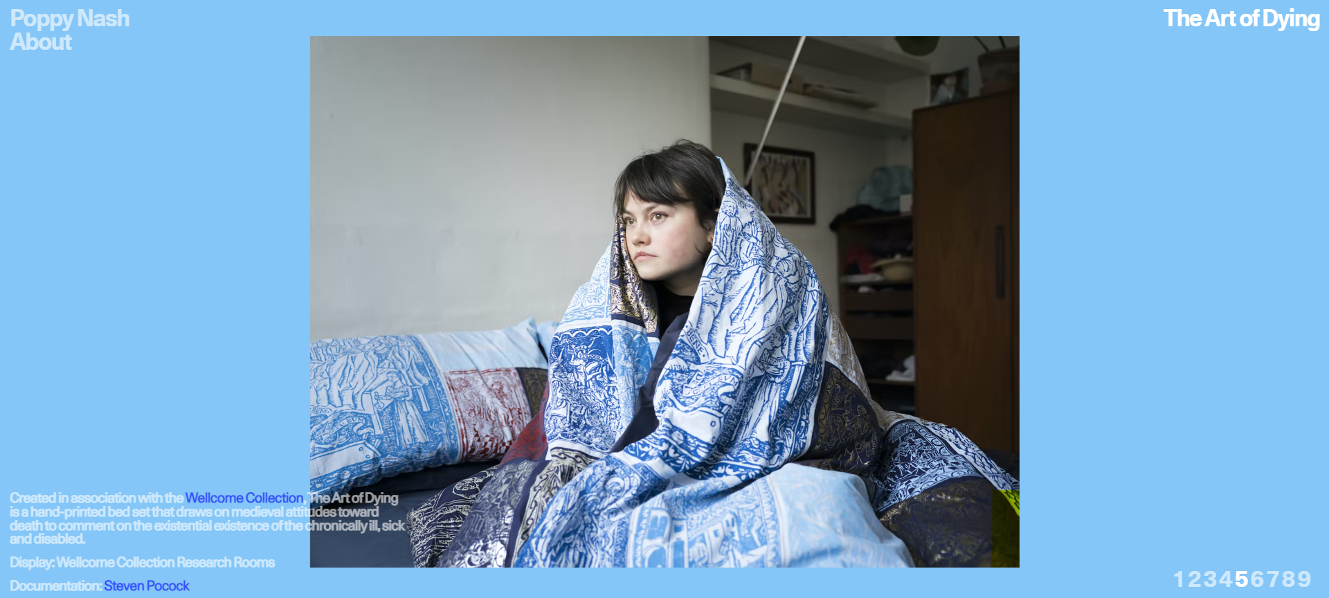
One of my favourite pieces of her's is the 'art of dying'. In this project she created a hand-printed bed set that draws on medieval attitudes towards death to comment on the existential existence of chronically ill and disabled people. She created a self portrait of her sat huddled up in the duvet. This is normally something that's cosy and comforting to do, and I think that this plays into the piece perfectly.
So often disabled and chronically ill people have to come to terms with the fact that we are going to pass away sooner than we would have done if we were 'healthy', and in order to be able to cope with this soul crushing truth, you have to make peace with it.
The duvet also signifies the weight that this has on us. Duvets are normally something that are quite heavy. The weight of living in a constant state of unknown, watching friends and people in your community pass away, having to deal with the full-time job of being chronically ill or disabled, the constant fear of death.
*Please note: I am currently still in the research stage before I move onto the development of my design ideas and wish to continue the project as a formal submission in April.*
See all year 1 work